#FFFFFF
#450CC1
#404040
Colour Theme
Design Brief
The previous website was catered to show the product features of a matrimonial service and how it is beneficial for users to be in a platform with zero fake profiles. The brand ideology later changed to introducing matchmakers who can guide and help users in finding the one.
This revamp was more the introduce the new head matchmaker and how they can bring in a difference to the whole process.
Ratings section
How a matchmaker/brand can help users
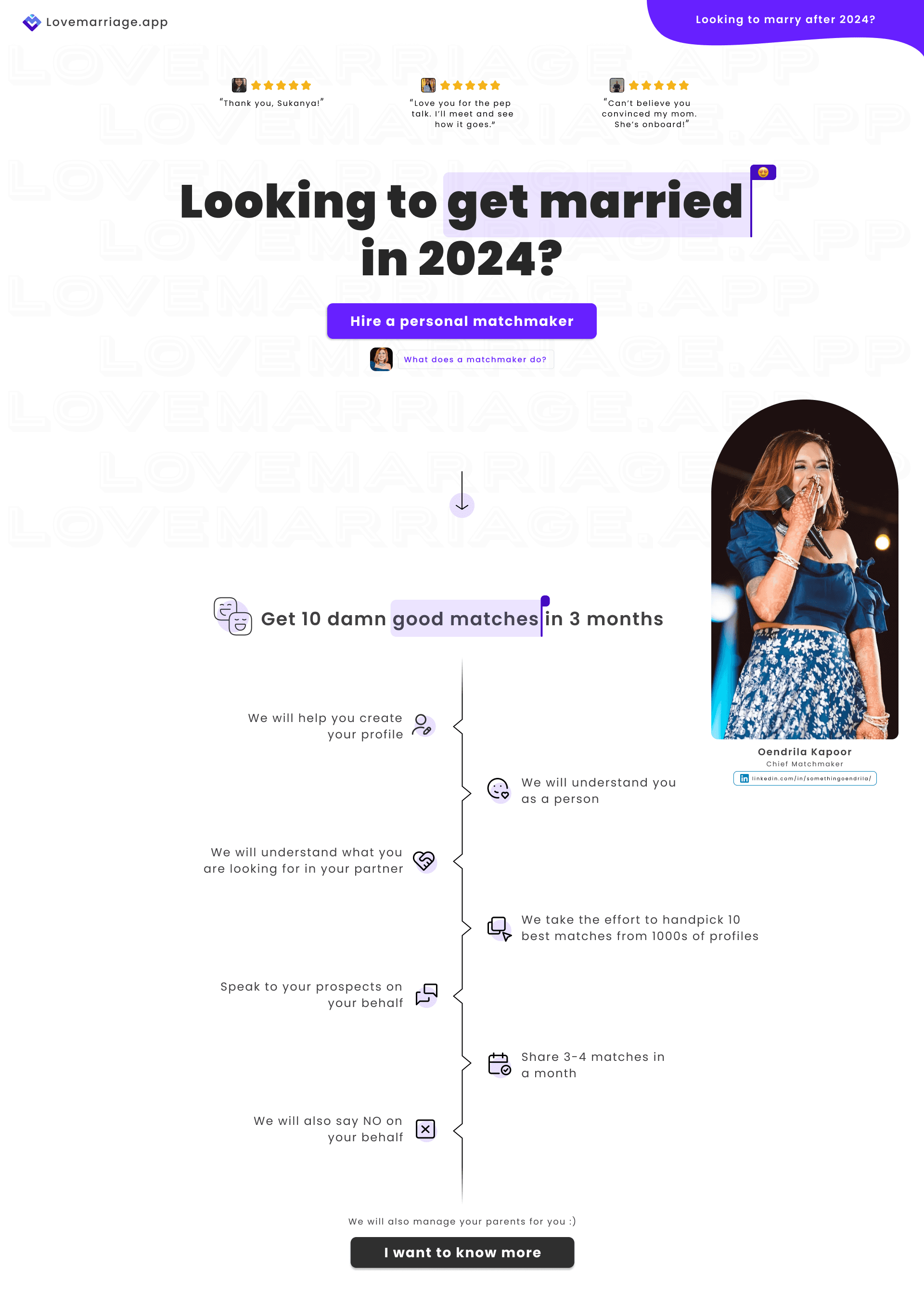
Personalised letter from the founder to make the brand more relatable.
Comparison table to show how the brand is different from other ways of searching for a partner


FAQ section
Highlighting personalised experience vs other brand’s partner searching experience
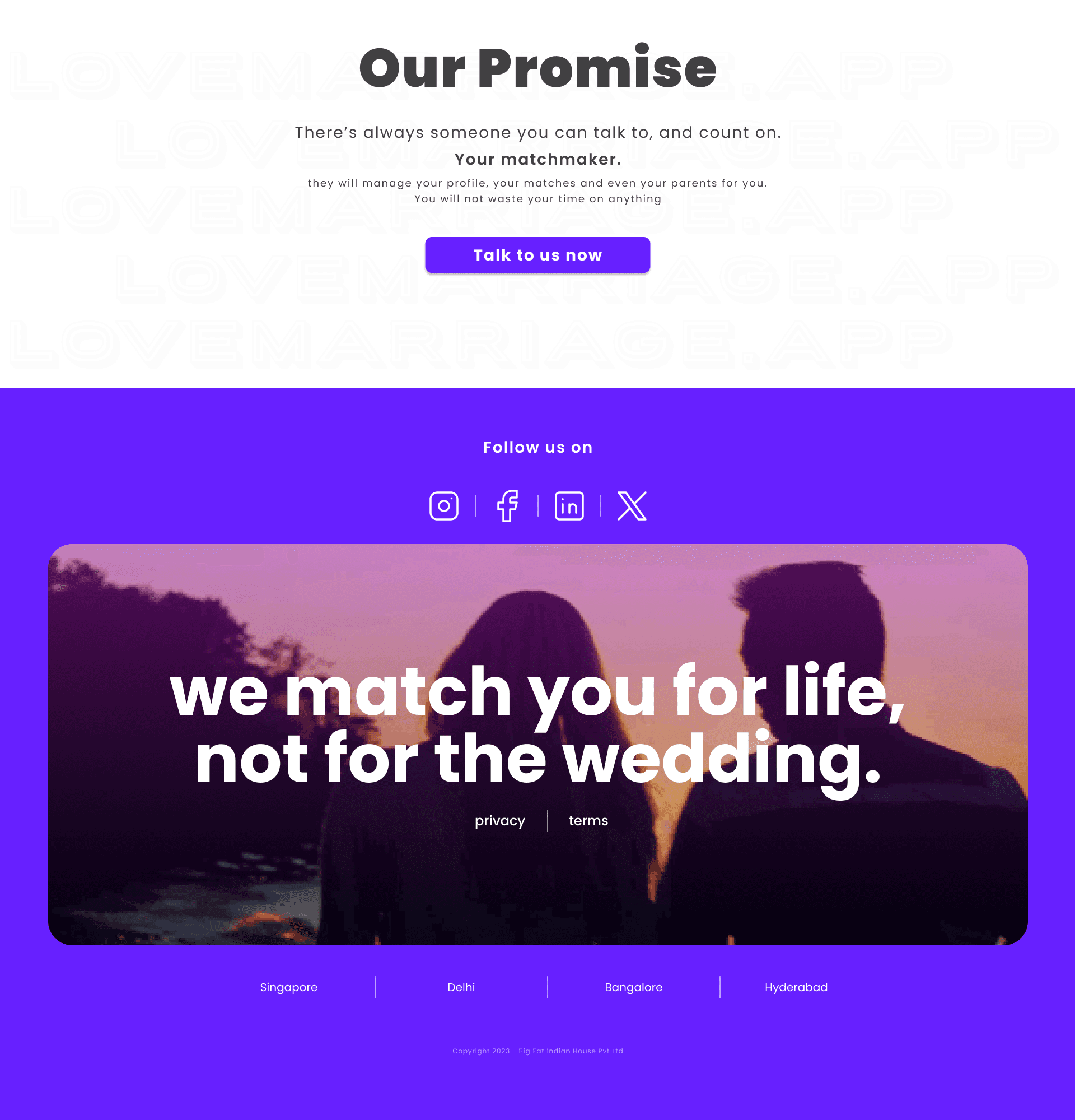
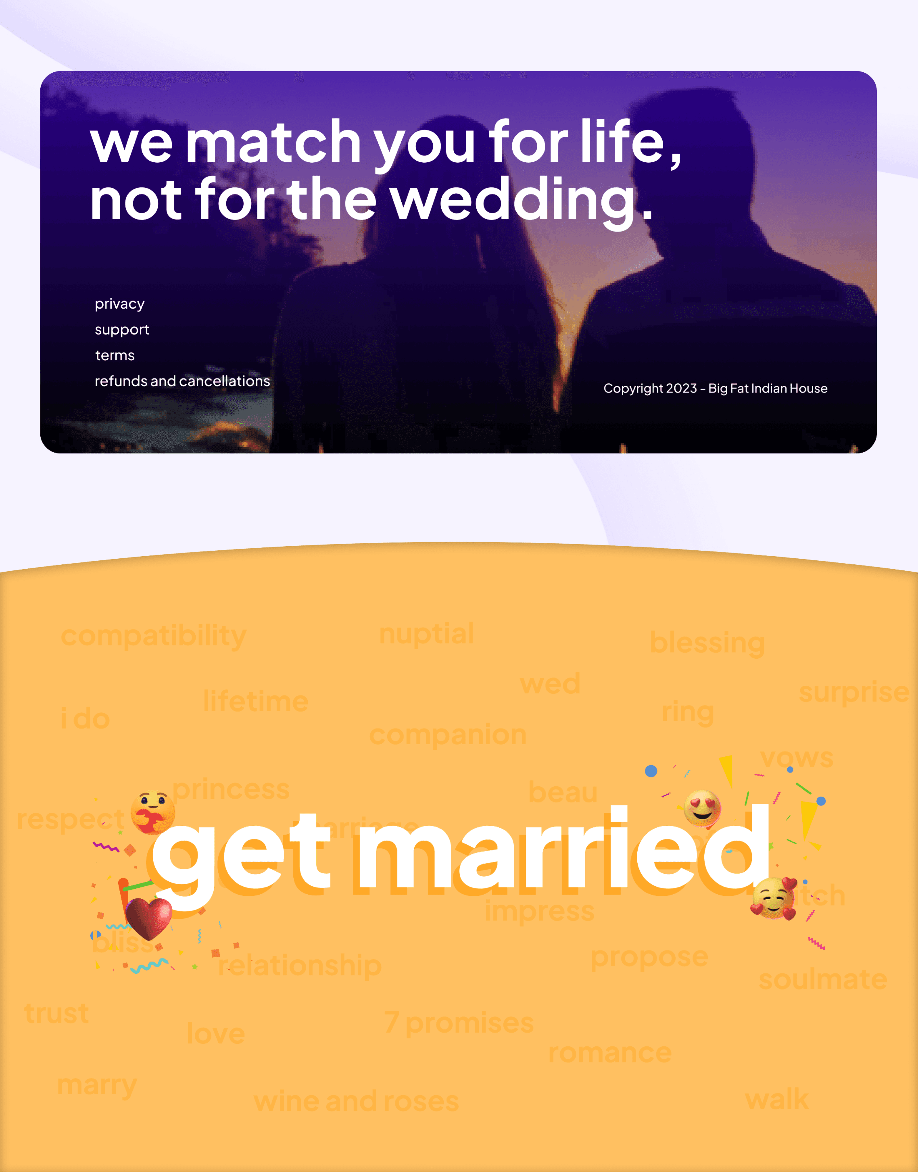
Footer section
Previous Version
#450CC1
#450CC1
#450CC1
#450CC1
Colour Theme
The previous website was catered to show the product features of a matrimonial service and how it is beneficial for users to be in a platform with zero fake profiles. The brand ideology later changed to introducing matchmakers who can guide and help users in finding the one.
Design Brief
Section to highlight top features of the brand

User onboarding cards
Card section to fit more features and brand highlights

User onboarding card animation
Appears on scrolling twice after the footer
Footer Animation change
NEXT PROJECT >>>
CHECK OUT
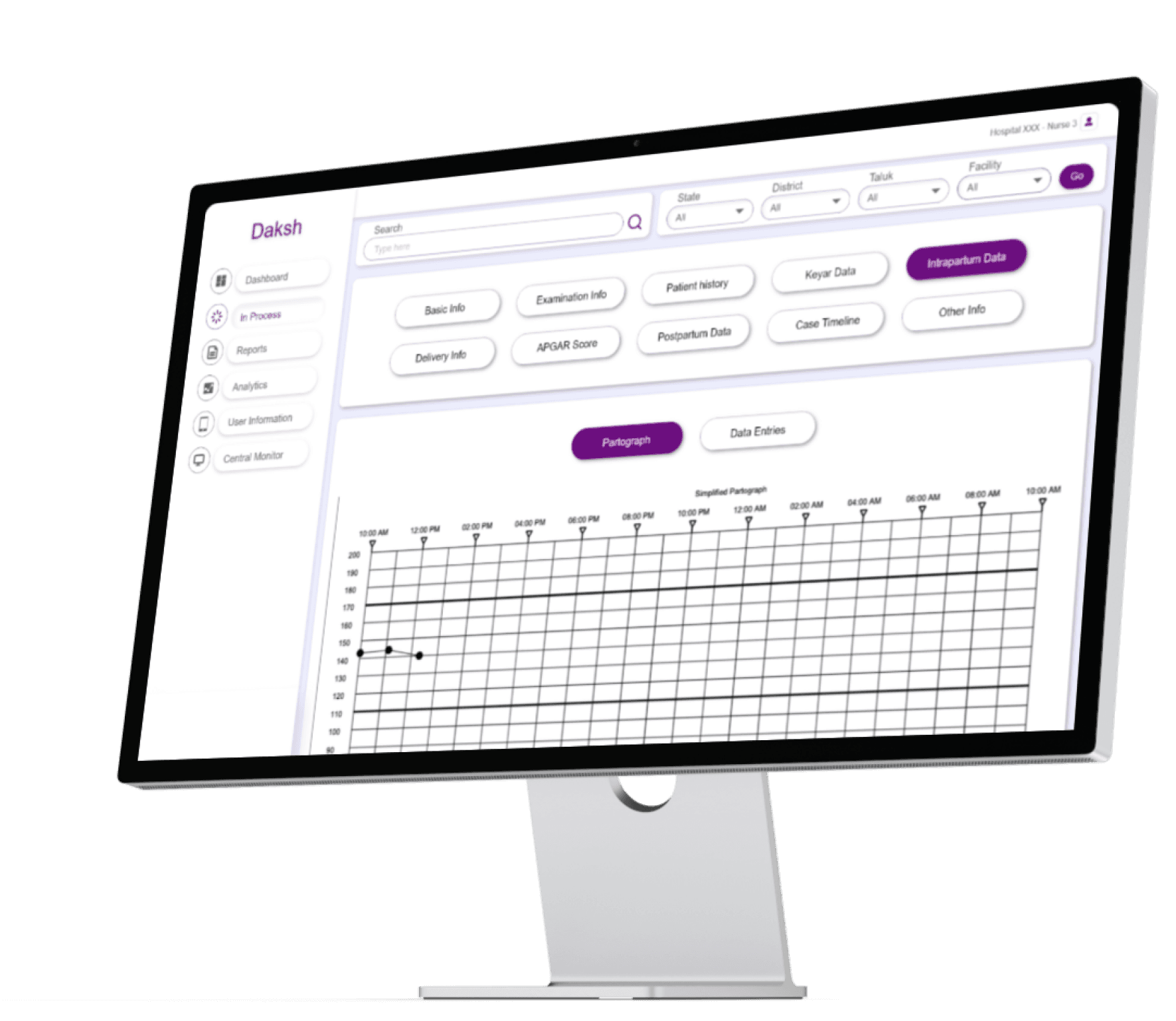
Patient management & monitoring dashboard